Thumbnail Visual System
Moveworks Marketing
Role: Lead Visual Designer
Scope: Visual concept, art direction, template design
Focus: Accessibility, clarity and engagement in educational content
Overview
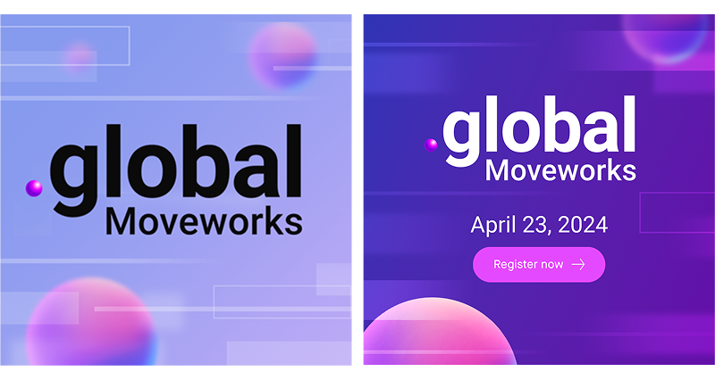
Moveworks creates educational content to help people understand and adopt AI at work. While the subject matter is complex, the goal of this project was simple: make learning about AI feel clear, friendly and unintimidating at first glance.
Thumbnails play a critical role in that experience. They are often the first interaction someone has with the content, and they set the emotional tone before a single word is read. This project focused on designing a thumbnail visual approach that felt inviting, lightweight, and easy to understand, without oversimplifying the ideas behind it.
Challenge
AI content can easily feel overwhelming, especially when visuals lean too technical, abstract or serious. Existing thumbnails were functional, but they didn’t consistently communicate approachability or guide the viewer on what to expect.
Key challenges:
-
Making complex topics feel less intimidating at a glance
-
Creating visual clarity at very small sizes
-
Helping viewers quickly understand what the content is about
-
Keeping the tone aligned with the Moveworks brand without feeling corporate or rigid
The goal wasn’t to explain AI visually; it was to lower the barrier to entry.
Approach
I approached this as a communication problem first, not a system exercise. Every design decision was guided by one question: Does this make the content feel easier to approach?
Friendly Visual Language
I leaned into simple shapes, generous spacing and high contrast to keep compositions readable and visually calm. The tone was intentionally light, designed to feel informative, not instructional or technical.
Clear Hierarchy
Each thumbnail was designed to communicate one primary idea. Titles, supporting cues and visual elements were arranged to guide the eye quickly, making it easy to scan and understand even in crowded feeds.
Consistency Without Rigidity
Rather than enforcing strict layouts, I created a small set of flexible patterns that allowed variation while maintaining familiarity. This helped the content feel cohesive without becoming repetitive or stale.
Execution
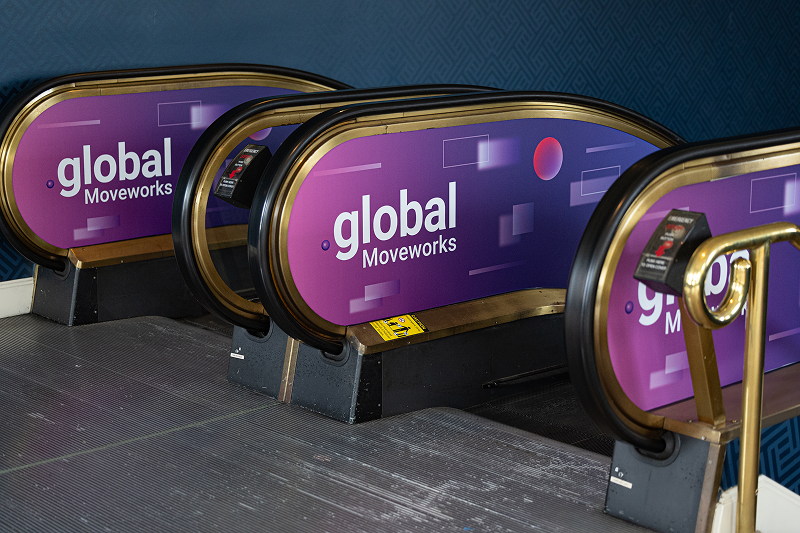
The final output included a collection of thumbnail designs used across educational articles, product explainers, and marketing content. Each thumbnail was optimized for real-world use, tested at small sizes and in-context to ensure clarity and friendliness held up across platforms.
I also worked closely with content partners to ensure the visuals were easy to reuse and adapt, enabling teams to focus on storytelling rather than design friction.
Outcome
The refreshed thumbnails helped:
-
Make AI-related content feel more approachable and less intimidating
-
Improve clarity and scan-ability across content feeds
-
Create a more consistent and friendly visual presence for educational materials
-
Support faster content creation without sacrificing quality or tone
Stakeholder feedback consistently highlighted that the content felt more welcoming and easier to engage with, especially for audiences newer to AI.
Reflection
This project reinforced that good visual design isn’t just about aesthetics, it’s about empathy. When the subject matter is complex, the role of design is often to reduce friction, build confidence and invite curiosity. By focusing on clarity, warmth and simplicity, this project helped shift the tone of AI education from intimidating to accessible, making space for learning to feel approachable rather than overwhelming.


Thumbnail Visual System
Moveworks Marketing
Role: Lead Visual Designer
Scope: Visual system design, art direction, template architecture